How to customize your quiz
If you prefer, you can check out this information in video format.
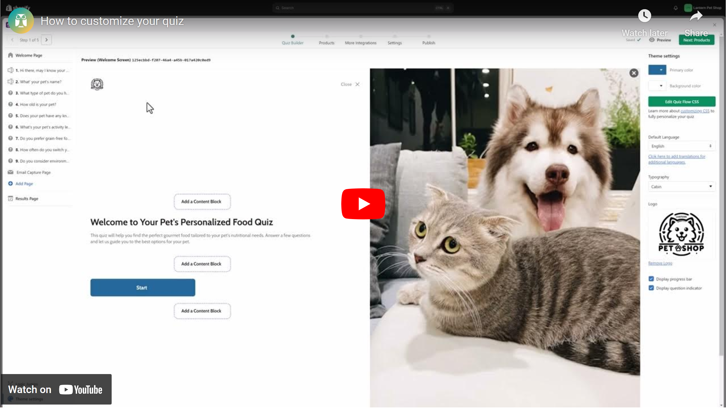
By branding your quiz, you can make it match the look and feel of your storefront, making it a seamless and familiar experience for your customers.
To get started, open Lantern in the Shopify Admin. From the Quizzes tab, click the Edit quiz icon next to your quiz.
Welcome Page
Start off by welcoming your customers and inviting them to complete your quiz. You can even add an optional description.
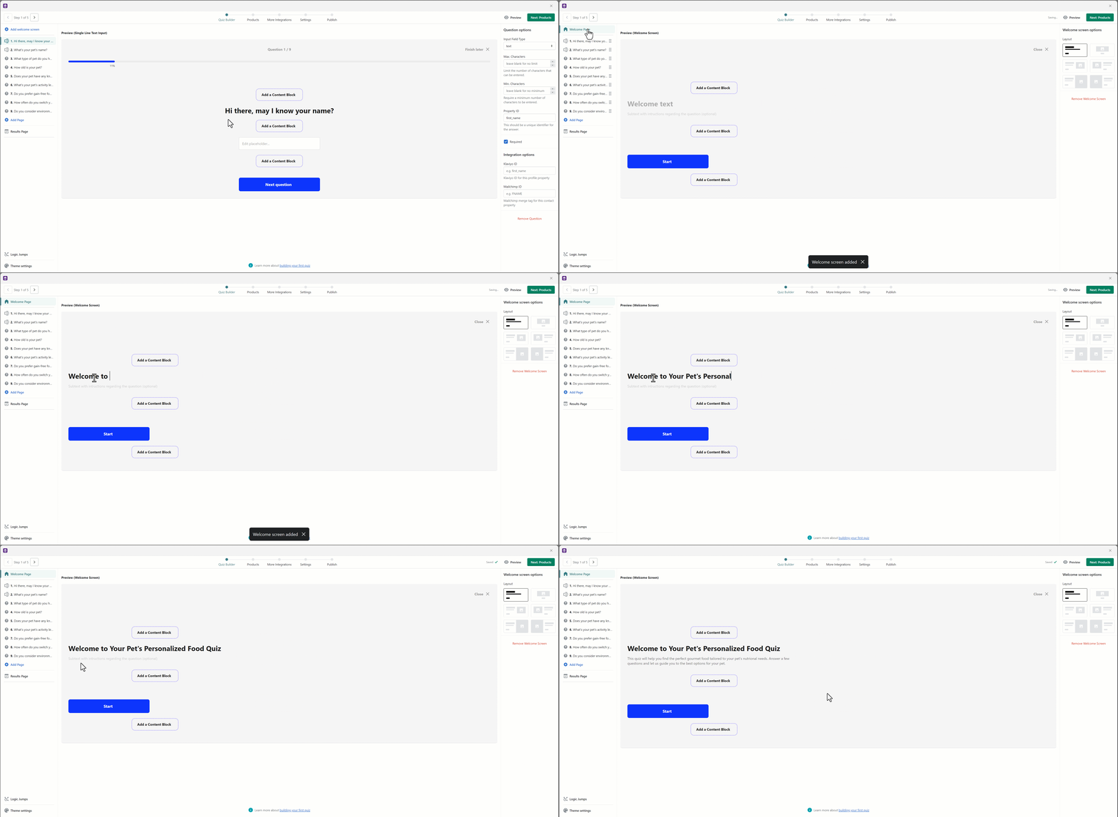
Choose a layout from the right-hand sidebar. By default, this is made of two simple lines of text and a Start button, but you can also upload and add media such as an image, GIF or video. Using the editor, you can play around and see how your welcome page will look with different layouts.
Theme Settings
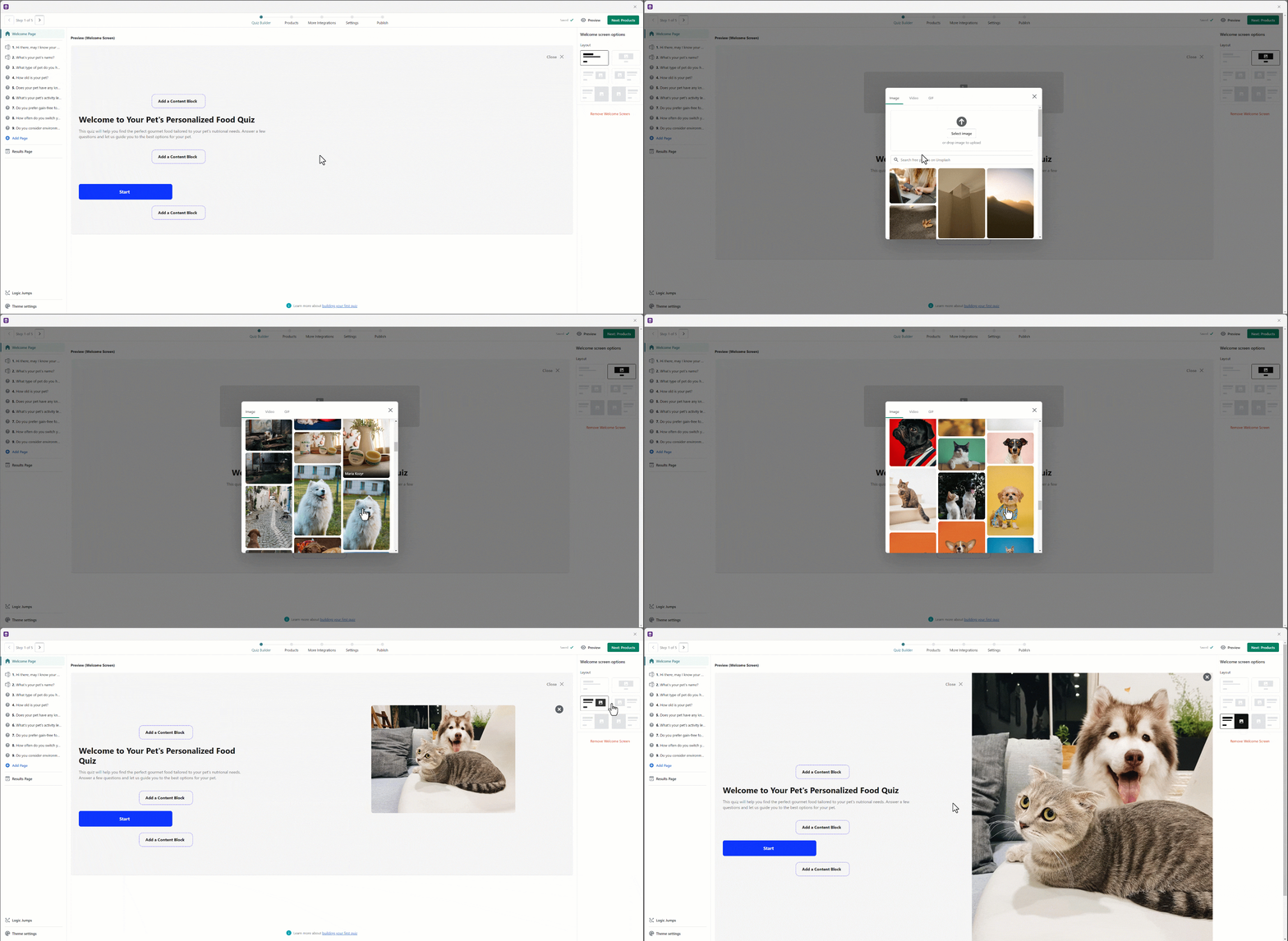
Theme Settings allow you to customize the background and accent color of the quiz, your font, upload your logo and select your quiz language.
To access these options, from the Quiz Builder, select Theme settings at the bottom left of the screen.
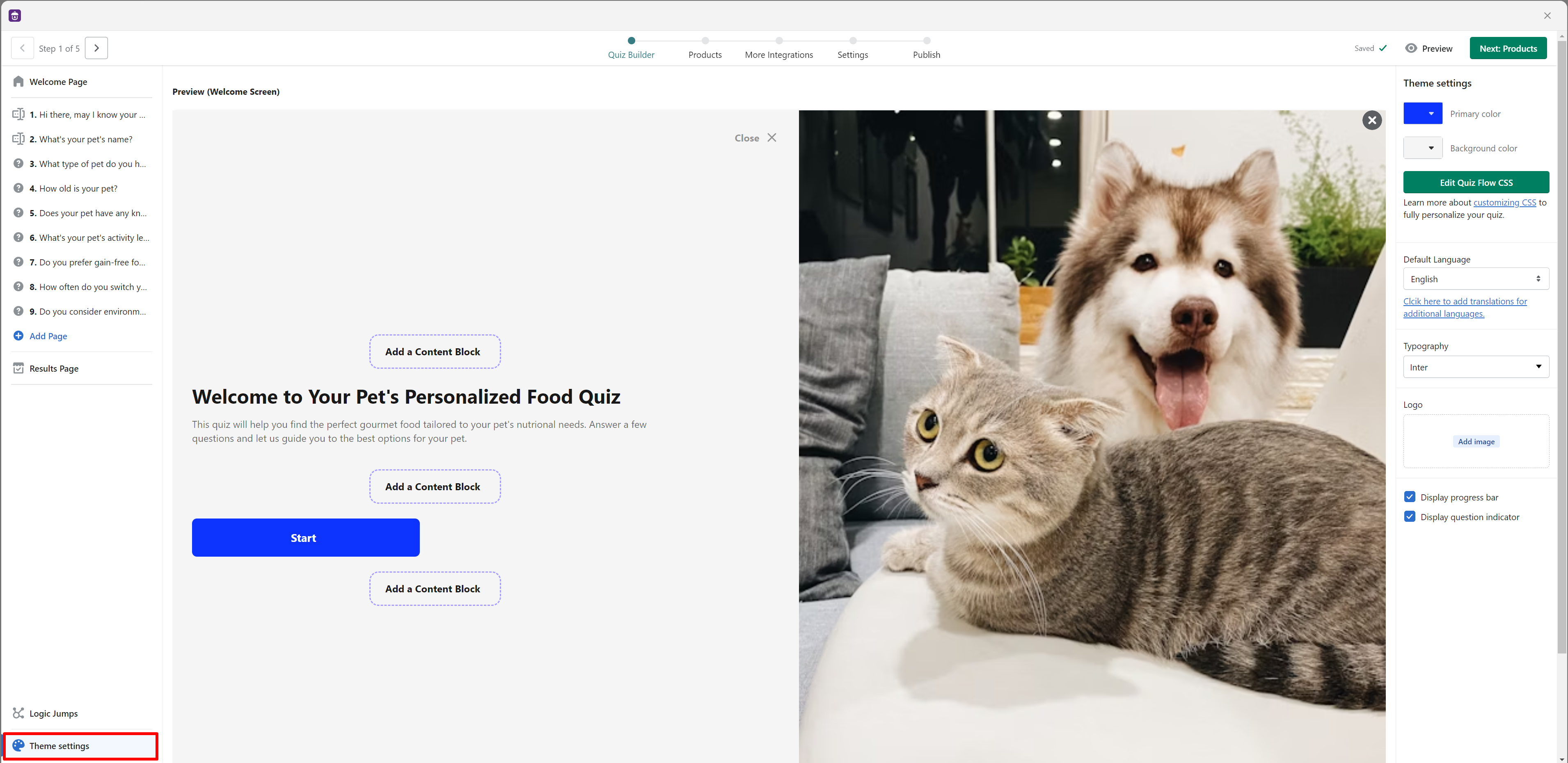
- Colors: You can change the Primary color to your brand color, this color is used for the main buttons and accents in the flow.
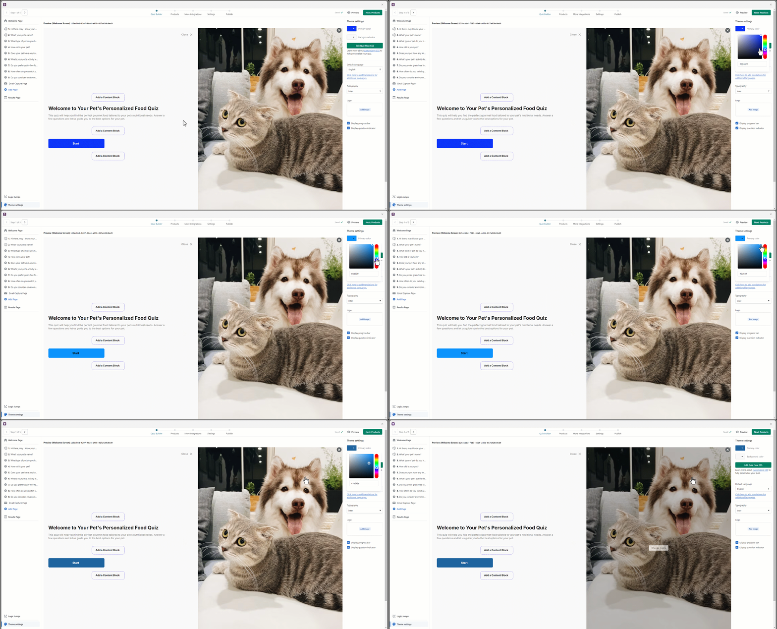
You can change the background color and choose from a range of colors to better match your brand or to make the quiz visually distinct.

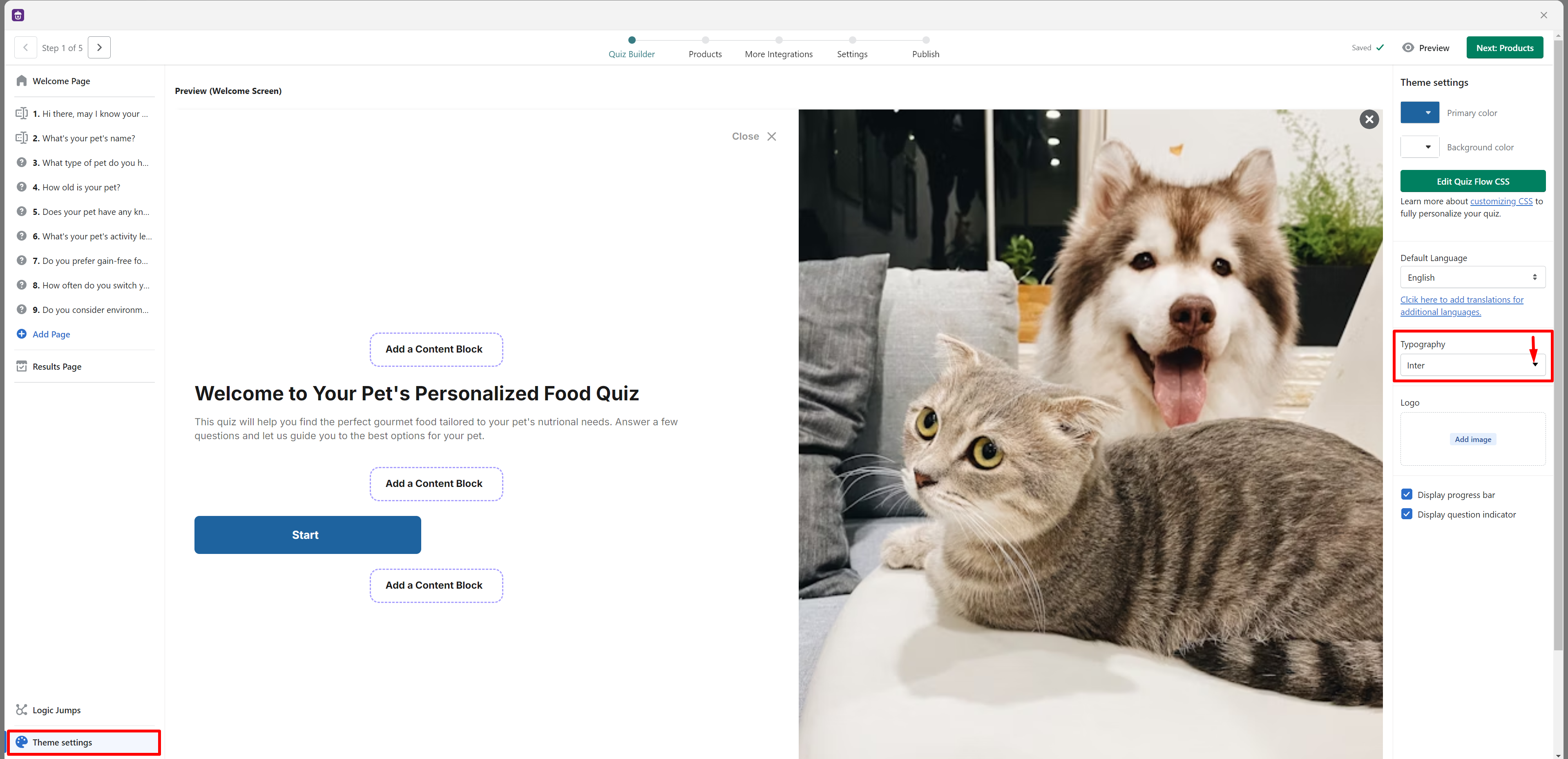
- Font: Select a font for the flow in the Typography section. We currently support the most popular Google fonts, so we're confident there should be one that matches your brand.
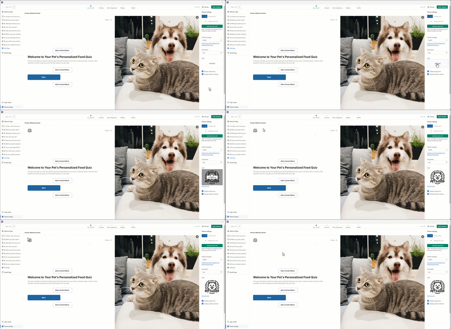
- Logo: Upload your logo in the Logo section, it will be shown in the top left of the finder.
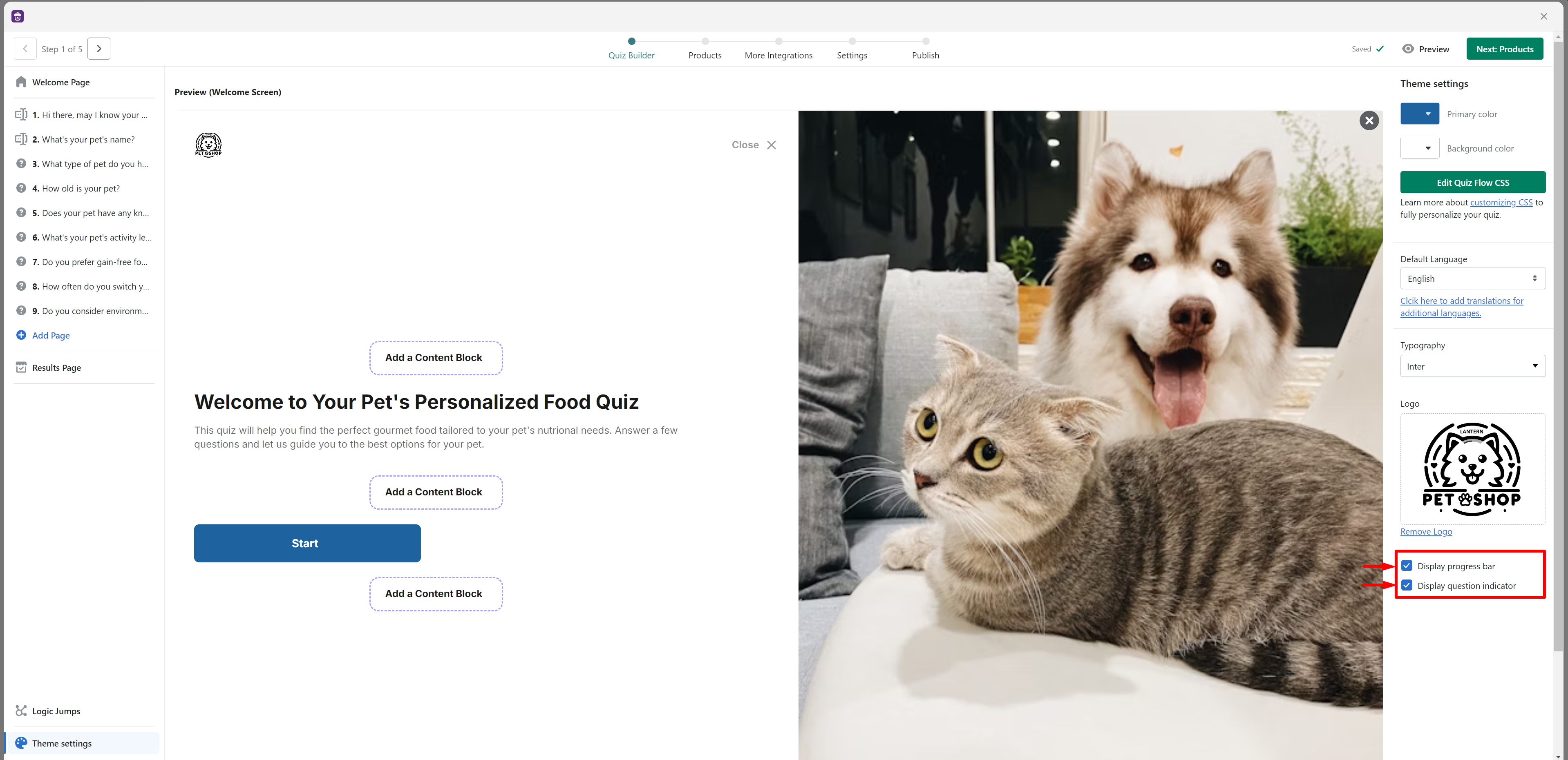
- Additional settings: There are some additional settings you can configure for your quiz:
- Display progress bar: Toggle the progress bar at the top on or off.
- Display question indicator: Toggle the question indicator at the top on or off.
- Language: Set the language in which your flow is displayed. For more information, please check out our translations guide.
Customize questions with text-based answers
By default, all questions are required to be answered. Both answers and questions have optional descriptions that you can use to provide more details and further explanations.
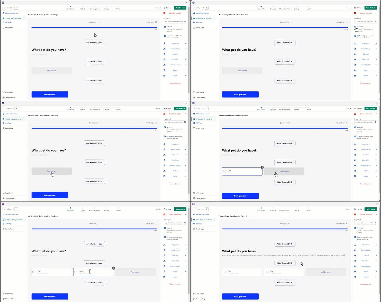
Design settings can be found on the right-hand side of your questions.
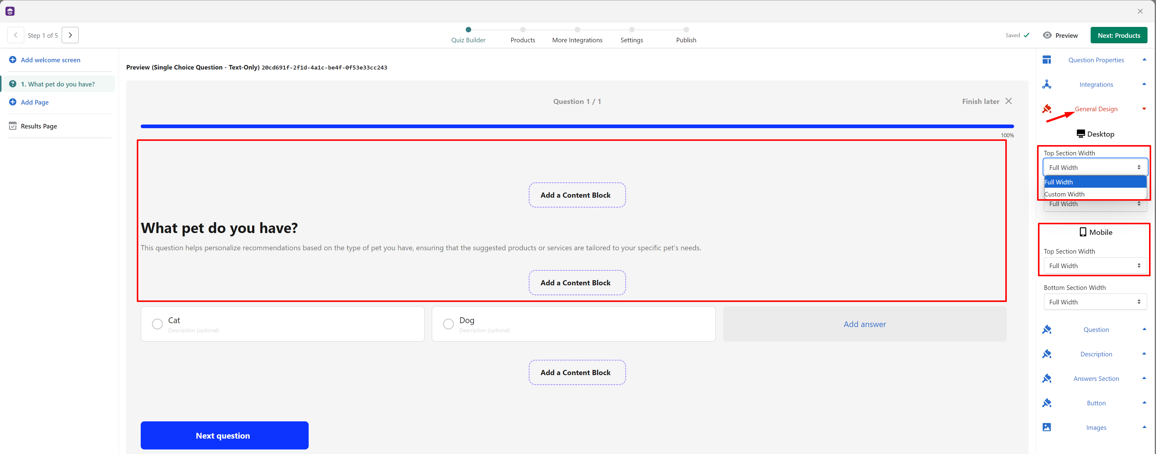
- General Design Section
Top Section Width: The default setting is Full width, but you can customize the width by specifying a custom width in pixels for both Desktop and Mobile view.
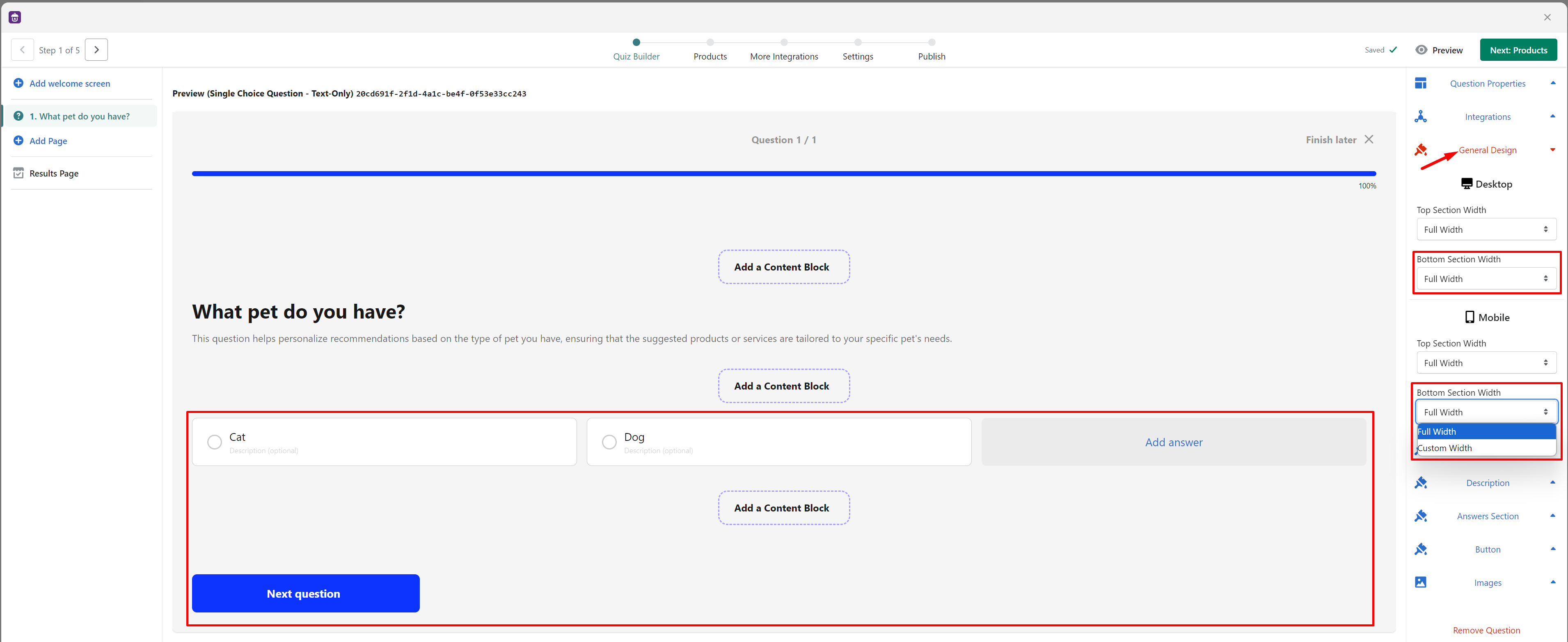
Bottom Section Width: Similar to the top section, the default is Full width. However, you can also apply a custom width in pixels for both Desktop and Mobile views.
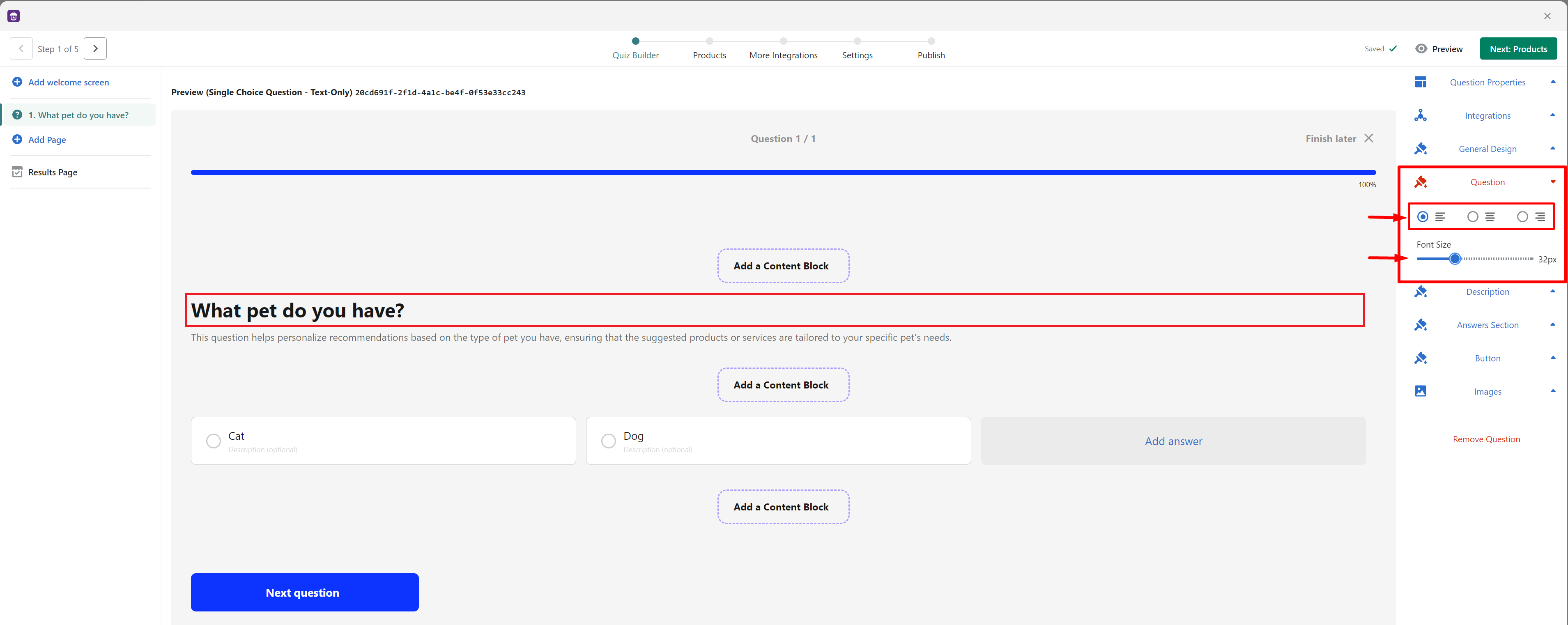
- Question Section
- Text alignment: Choose from 3 options (left-aligned, center-aligned, and right-aligned)
- Font size: Default is 32px, adjustable from 1px to 100px
- Description Section
- Text alignment: Similar to Question, you can choose from 3 options (left-aligned, center-aligned, and right-aligned)
- Font size: Default is 16px, adjustable from 1px to 100px
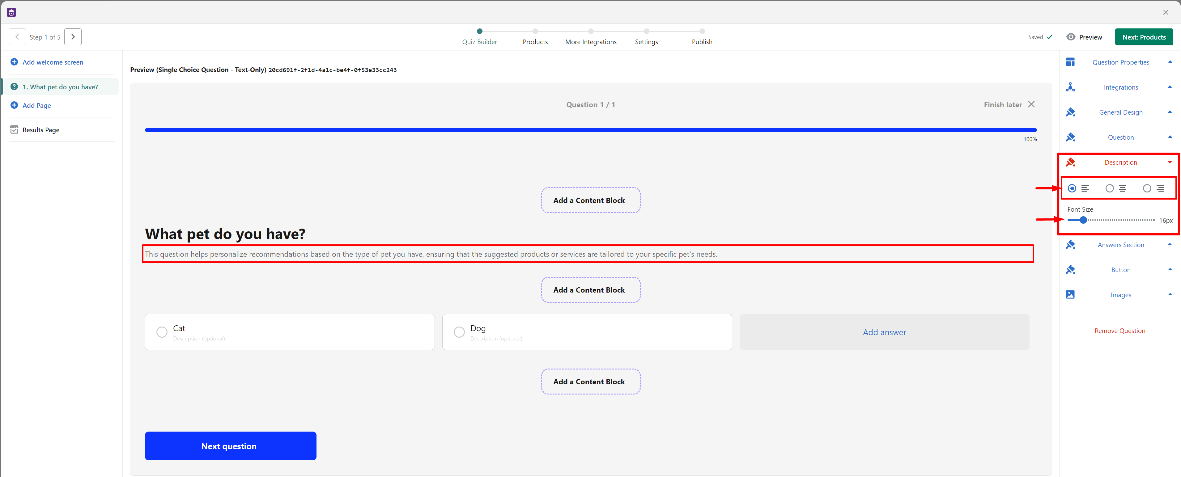
- Answer Section
- Text alignment: Similar to Question and Description, you can choose from 3 options (left-aligned, center-aligned, and right-aligned)
- Answers per Row: Select the number of answers to display per row for both Desktop and Mobile views. This setting is adjustable from 1 to 10
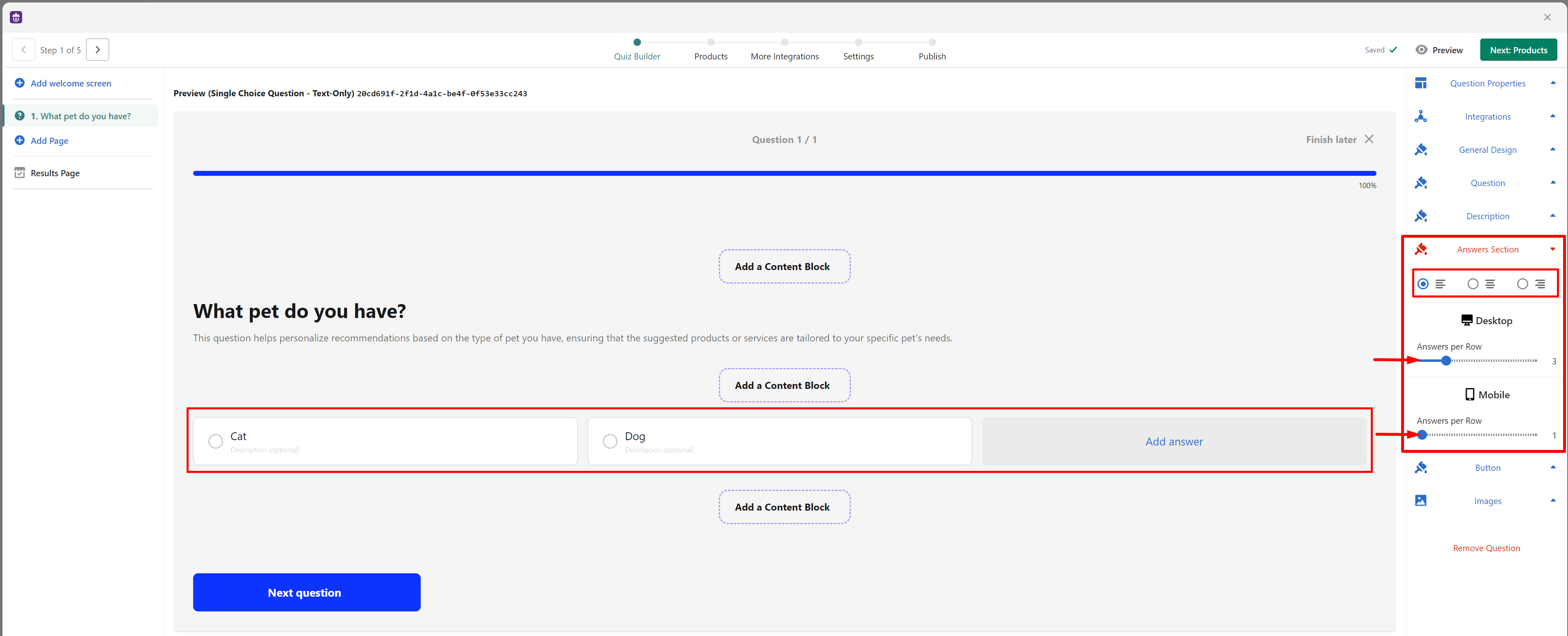
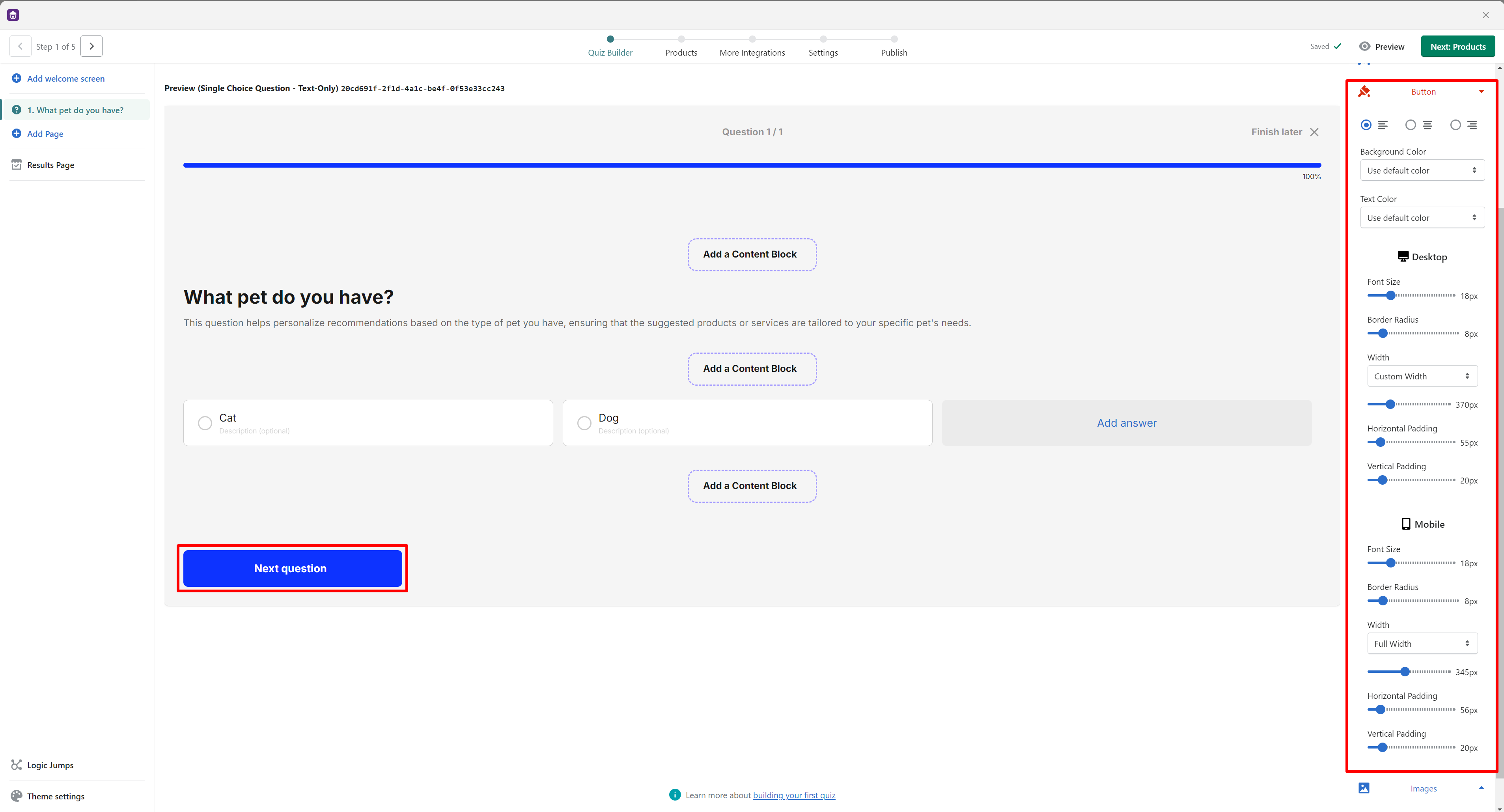
- Button Section
- Alignment: Choose from 3 options (left-aligned, center-aligned, and right-aligned)
- Background Color and Text Color: By default, these settings are configured to "Use default color," which applies the primary color from your Theme settings. If you prefer, you can select "Use custom color" to apply a specific background and text color of your choice.
- Font Size: Default is 18px, adjustable from 8px to 50px, applicable to both Desktop and Mobile views
- Border Radius: Default is 8px, adjustable from 0 to 60px, applicable to both Desktop and Mobile views
- Width: Choose from 3 options (Auto, Custom, or Full Width), applicable to both Desktop and Mobile views
- Auto: Automatically adjusts the width based on the length of the button text, including padding
- Custom Width: Adjustable from 0 to 1500px, allowing you to set a specific width
- Full Width: Expands the button to use the maximum width of its container
- Padding: Adjust the padding within the button to control the space between the button text and the edges. You can customize both the horizontal and vertical padding to fine-tune the button's appearance both in Desktop and Mobile views
Customize questions with image based answers
Additional customizations are available for questions with image based answers.
- Image Shape: Choose from shapes such as square, landscape, portrait, or circle to better suit your brand’s style.
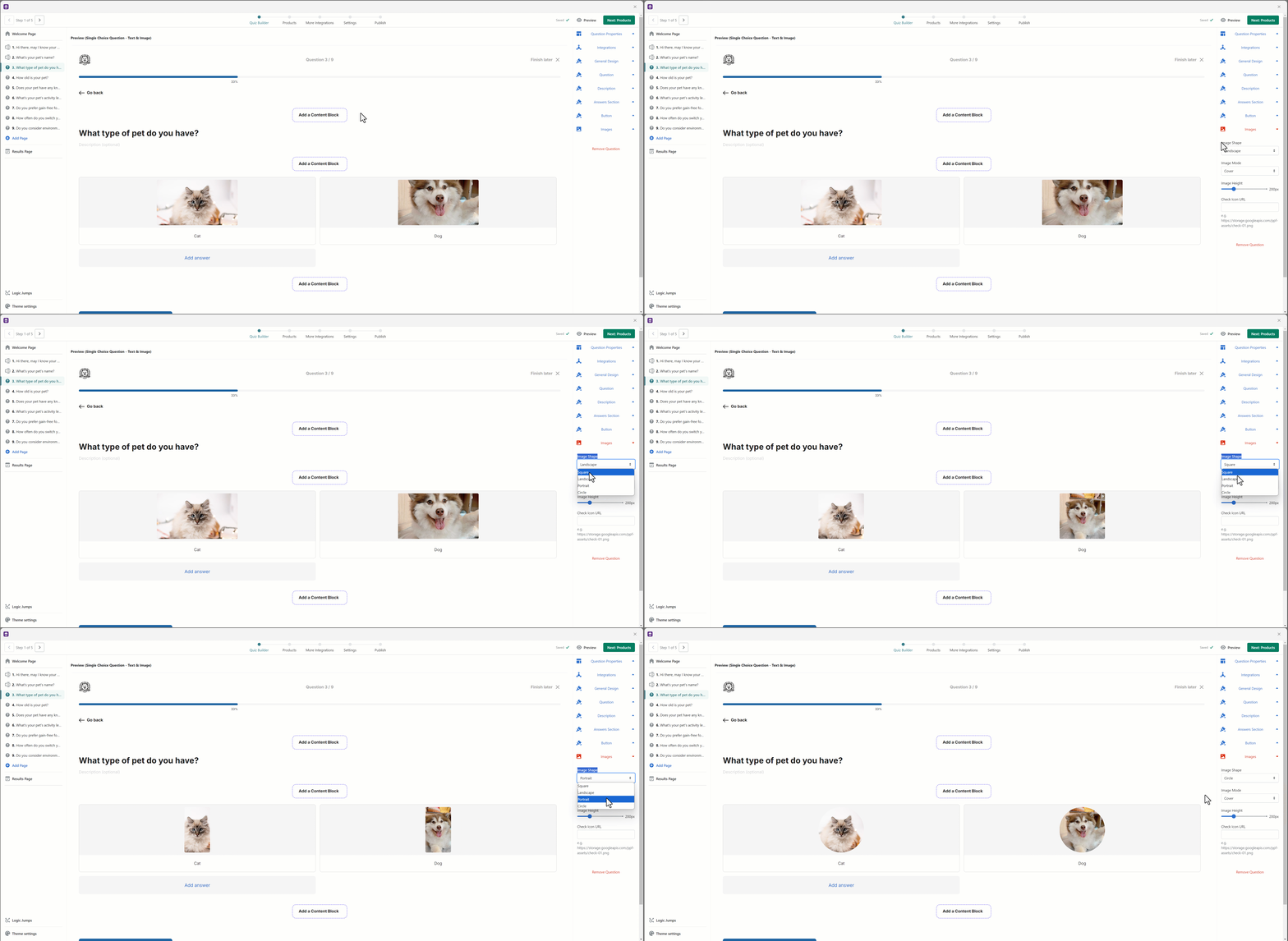
- Image Height: The default image height is set at 200 pixels, but you can adjust this between 100 and 500 pixels depending on your layout needs. This is particularly useful when you have multiple images per row, as resizing them can prevent them from becoming distorted.
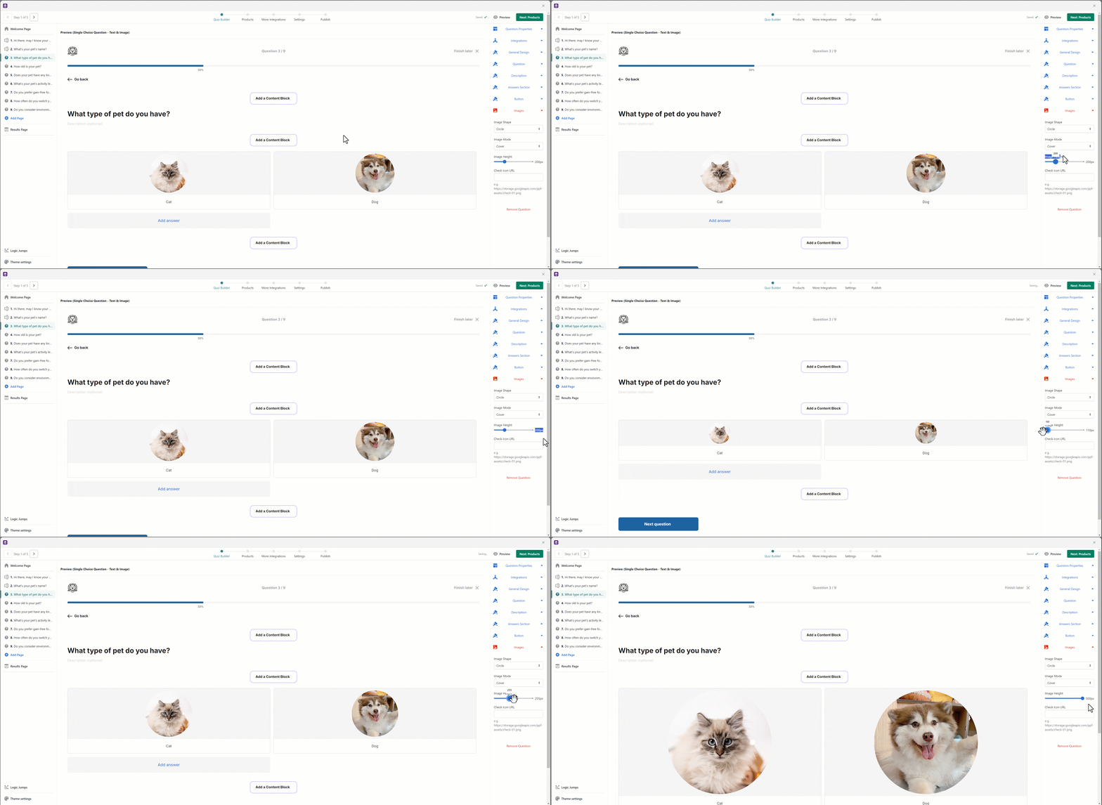
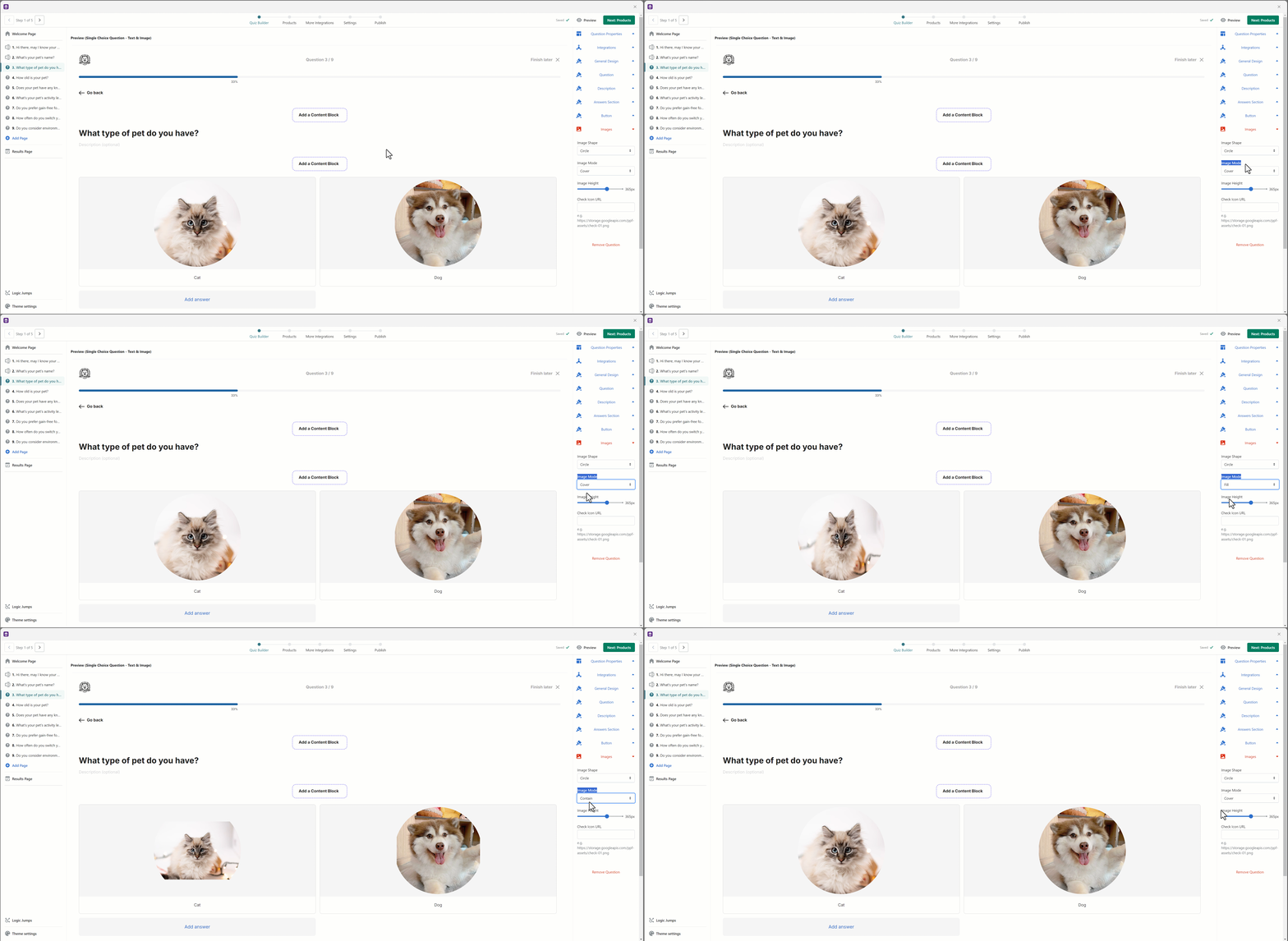
- Image Mode: Lantern now supports three image modes—cover, fill, and contain. Each mode affects how the image fits within the allocated space:
- Cover: Crops the image to fill the space without distortion, but some parts of the image may be lost.
- Fill: Stretches the image to fill the space, which may result in distortion.
- Contain: Fits the entire image within the space without distortion, adding transparent margins if necessary.
- Checkmark Icon for Selected Answers
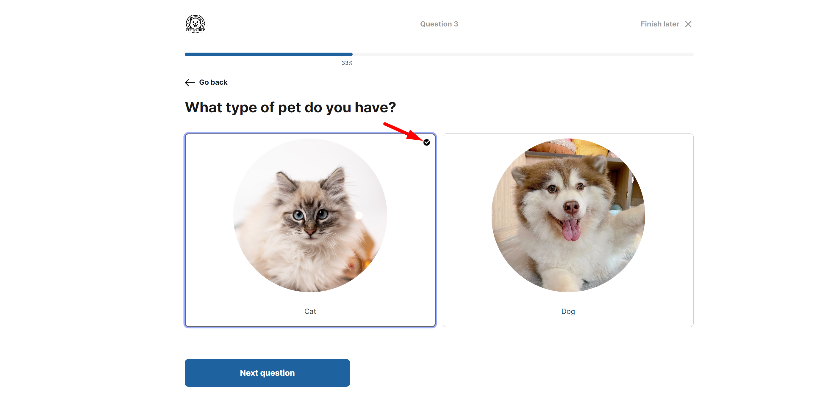
You can add a checkmark icon or any custom icon to indicate selected answers in quizzes.
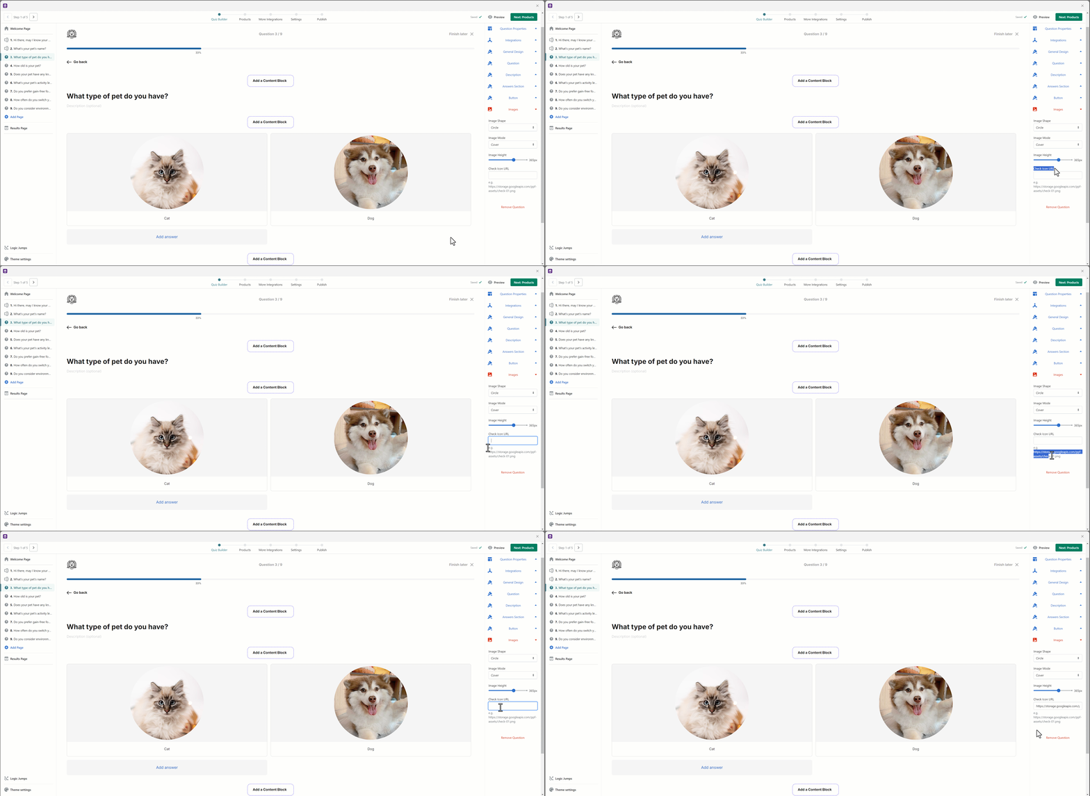
This feature helps make it clear which options have been selected, enhancing user experience. By default, Lantern provides a simple checkmark icon, but you can upload your own to match your branding.
Content blocks
Content Blocks in quizzes allow you to add and customize various elements like text, images, lists, and links on different pages of your quiz, including the Welcome, Question, Transition, and Email Capture Pages. These blocks can help you provide extra context, enhance brand visuals, and engage users more effectively. They offer flexibility in placing content where you want it, whether it’s above, below, or between quiz elements, ensuring a personalized and cohesive experience for users.
You can get started by navigating to the Quiz Builder and selecting the page where you want to add a Content Block.
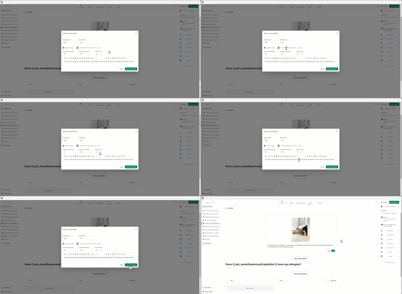
For more detailed guidance on using Content Blocks, please refer to this article.
Dynamically reuse customer input data in questions
Incorporating dynamic data reuse into your quizzes allows for a highly personalized user experience. By capturing user information, such as a first name, and creating property IDs for each question, you can reference this data throughout the quiz to create a more engaging interaction. For example, if you capture a user's first name, you can greet them later in the quiz.
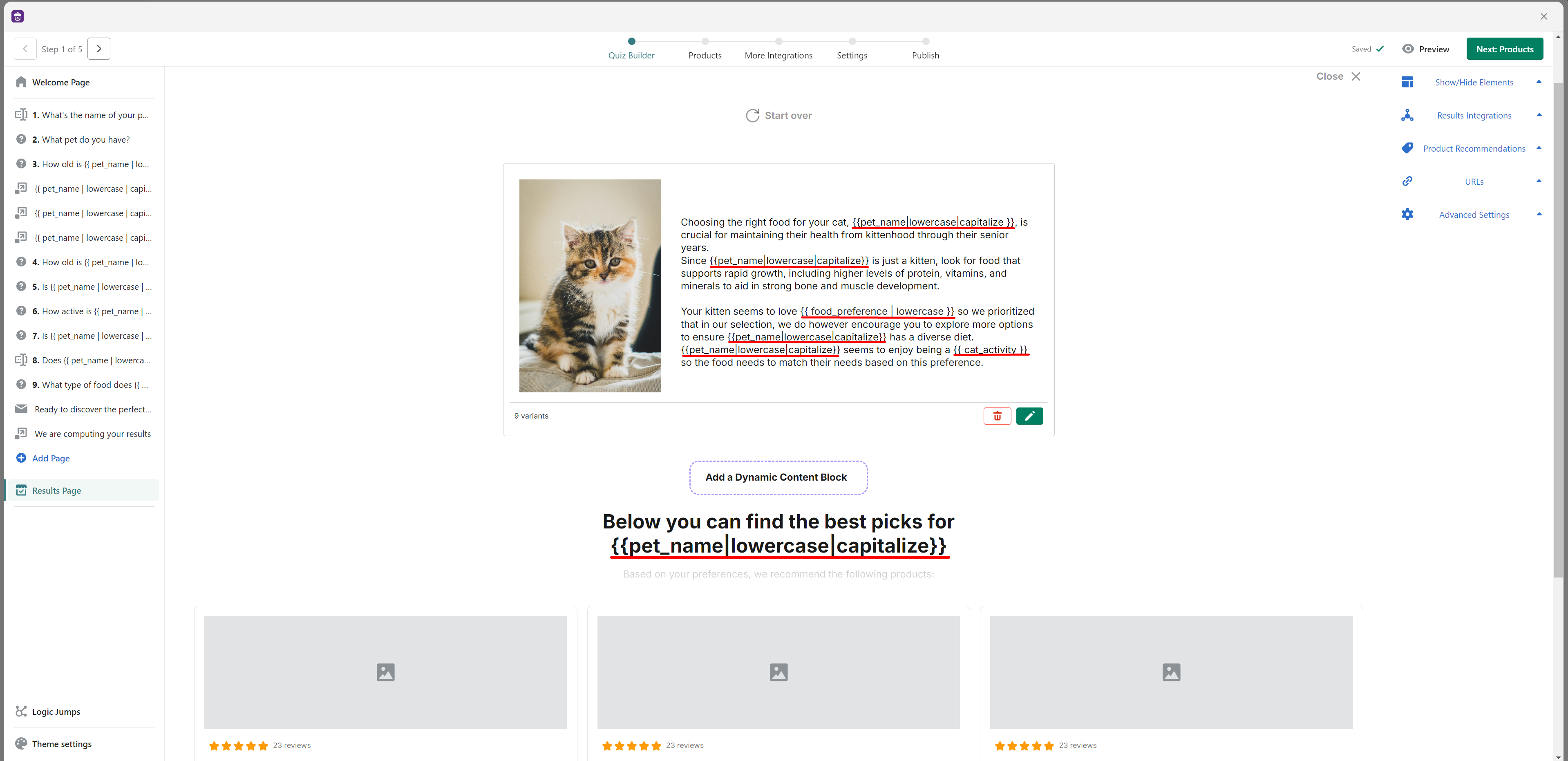
For more information, you can view the complete guide here.
By customizing each element of your quiz, you can create a truly engaging and personalized experience for your users. For any help or questions, feel free to reach out to our support team.